Mapping Historical Crop Yields across India
Data Visualization
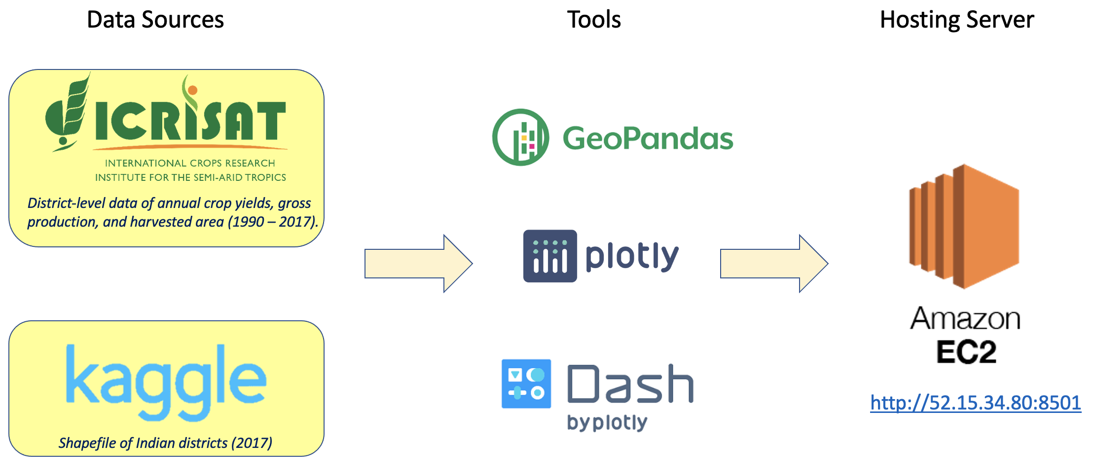
Maps offer an intuitive means to represent the spatial distribution of data, helping users understand the geographic context and relationships between different locations. With human-induced climate change a reality, understanding evolutionary patterns in nationwide crop yields is essential to ensure food sustainability. India is the world’s second-largest producer of rice, wheat, sugarcane, groundnut, and cotton. Using Python, I built an interactive dashboard to visualize district-level yield distributions of these crops across India between 1990 – 2017. This dashboard (presently offline) was hosted on the Amazon Web Services EC2 server.
Note
- Github repo: agriyield_viz
- 2-minutes video presentation: YouTube link
- Presentation slides: PDF
- Programming language: Python (geopandas, plotly), Dash
- App hosting platform: Amazon Web Services EC2
This project was completed as part of the Erdös Institute Data Visualization Mini-course, Spring 2023.
Application features
I included a live walkthrough of the dashboard in my 2-minutes project presentation video, showcasing the following interactive features.
- User option to zoom in/out of the map
- Cursor hover displaying values of the plotted quantity for the selected district.
- Dropdown menu for selecting the quantity to visualize. Options include
yield (kg/ha),harvested area (1000 ha), andproduction (1000 tonnes). - Dropdown menu for selecting a crop of interest. Here, the available menu options are
Rice,Wheat,Sugarcane,Cotton, andGroundnut. - Slider to select a year between 1990 and 2017.
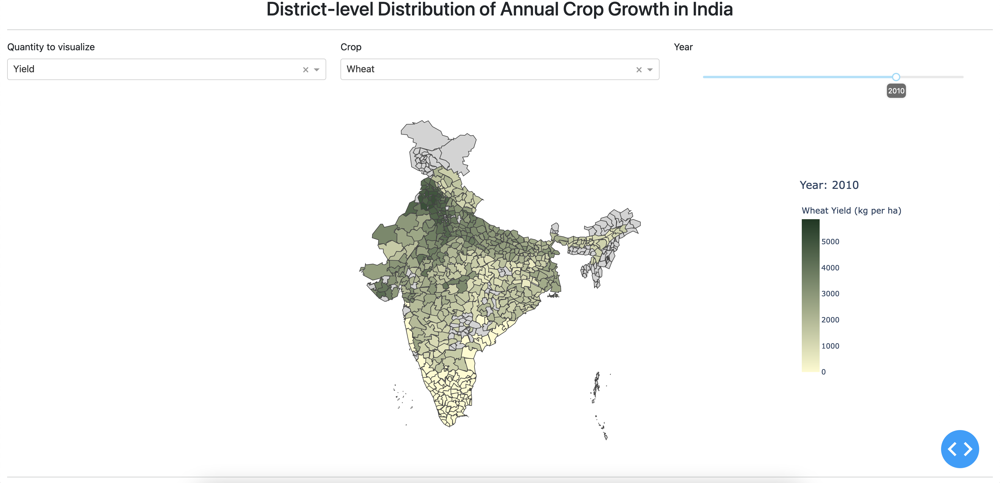
Screenshot of interactive dashboard
Project Workflow